


According to Princeton Energy Heatmap, the buildings with the highest energy use on campus are Frist Campus Center, Guyot Hall, Jadwin Hall, and Frick Chemistry Laboratory.
Princeton Energy Heatmap has been implemented as a tool to gauge energy consumption since it was founded in 2015 -- and is constantly updated live.
When website co-founder Annie Lu ’17 was a sophomore, she took COS 333: Advanced Programming Techniques, a class that spends six weeks working on projects in groups of three or four people. Lu and her group members, Adam Gallagher ’16 and Joshua Bocarsly ’15, decided to create a map that provides a visual representation of energy use in buildings on campus.
According to Lu, the Office of Sustainability had expressed to the course instructor, Professor Brian Kernighan GS ’69, that it had data for energy levels in University buildings that wasn’t being stored anywhere or utilized for any purpose. The Office communicated to Kernighan that they wanted some map or way to visualize this data.
The Office of Sustainability did not respond to request for comment by the time of publication.
To address this need, Lu's group created the Princeton Energy Heatmap. Kernighan noted that, by doing this, the group indeed provided a valuable service.
“It was a really well-done project that addressed a very important topic — good work all around,” he said.
Gallagher graduated from the University with a degree in computer science and is now a software engineer at Applied Predictive Technologies, while Bocarsly ’15 graduated with a degree in chemistry and a certificate in materials science and engineering. Bocarsly is presently a graduate student in UC Santa Barbara’s Ph.D. program in materials science.
Gallagher did not respond to request for comment by the time of publication.
“We got our idea [for the energy heat map] from the list of ideas on the course webpage,” Lu explained.
Bocarsly explained that the group was attracted by the idea of making something interactive and live.
“[We] liked the idea that we could use our time to create an app that would serve a good cause and wouldn’t die at the end of the COS 333 class,” he said.

As part of the project, Bocarsly explained that his group set up a database to save data as it is generated, and set up an API to make it accessible to our app and anyone else who wants to use it.
“We hope that this database will become a rich dataset for researchers who aim to study how energy is used and how energy use can be minimized,” he said. He also noted that he hopes that some people see their building’s live energy use and think more consciously about how they could use less power.
The Heatmap displays each building on campus in a color that represents the amount of energy that it is currently using. When a user clicks on a building, a sidebar pops up with a graph that tracks energy use in that building over time. The graph has options for displaying trends over the past days, weeks, or months.
Though the data on energy use had been available on the Office of Sustainability’s site before Heatmap’s launch, the information had been presented in a manner that made it difficult to analyze because the University did not provide any bases for comparison.
“The energy-level data was all being thrown into this XML file, which is basically a list of numbers that wasn’t being stored anywhere," Lu explained. "[The energy use numbers] were being taken from energy meters, were being taken and put in this file and thrown away, so we wanted to build a database to store this information in and visualize this data.”
Lu’s group had some professional help tackling this project.
“We worked with a company, WattVision, that is really into energy and partners with the Office of Sustainability. [WattVision] gave us some advice on how to approach this,” said Lu.
WattVision did not respond to request for comment by the time of publication.
Lu noted that Heatmap’s graphs showing past energy use were sparse at first. She explained that, for the first few months after the website’s launch, the data on the site was limited since the group had just begun its data storage. These gaps in data have filled out over the lifetime of the project, now allowing users to see clear trends and identify periods of time in which energy consumption is especially high on campus or specific buildings.
Though Heatmap provides lots of helpful information, Lu believes that the site is underutilized.
“Right now, it’s just something used for display, and you can go online and figure out energy levels of buildings, to see trends and things like that. I don’t think it’s actually been used for anything,” she said.
Lu believes the project has a lot more potential.
“There are different ways people could use [Heatmap]. Maybe, if Facilities people knew about which buildings were using a lot of energy, then they might be able to pinpoint those buildings to try and find ways to conserve energy in those buildings," Lu said.
University Facilities did not respond to request for comment by the time of publication.
Gallagher added in an email that the map has been an inspiration for other "students interested in the intersection between tech and the environment." Sustainable Software Initiative now maintains the map.
"Whether or not there's active development on the project, I'm glad to see it live on and give news ideas, relating to both tech and sustainability, to new students," Gallagher wrote.
The Princeton Energy Heatmap can be accessed at fac220l-heatmap.princeton.edu. According to Gallagher, the map was originally hosted on Gallagher's personal account, but was transferred to University hardware by Facilities over the summer making it more easily accessible and permanent.
This year's COS 333 projects will be presented May 8 through 10 in Friend 006. Additional information can be found at cs.princeton.edu/courses/archive/spring17/cos333/groups17.html.
This story has been updated to include comment from Adam Gallagher '16.
Read More

Princeton softball stands atop the Ivy League standings after defeating Yale
Dalynn HoltzclawThe Tigers sit two games ahead of second place and are on an eight-game winning streak. Should they finish as the No. 1 seed next weekend, they will host the Ivy League tournament.
The Tigers sit two games ahead of second place and are on an eight-game winning streak. Should they finish as the No. 1 seed next weekend, they will host the Ivy League tournament.
More to medicine than science: The Compassionate Medicine Fellowship combines the humanities and sciences
Christopher Bao and Ifeoluwa AigbiniodeEstablished in 2022, the Compassionate Medicine Fellowship brings together and supports Princeton pre-med students dedicated to practicing medicine through a compassionate lens. The ‘Prince’ sat down with members and organizers, past and present, to talk about the origins and goals of the fellowship.
Established in 2022, the Compassionate Medicine Fellowship brings together and supports Princeton pre-med students dedicated to practicing medicine through a compassionate lens. The ‘Prince’ sat down with members and organizers, past and present, to talk about the origins and goals of the fellowship.
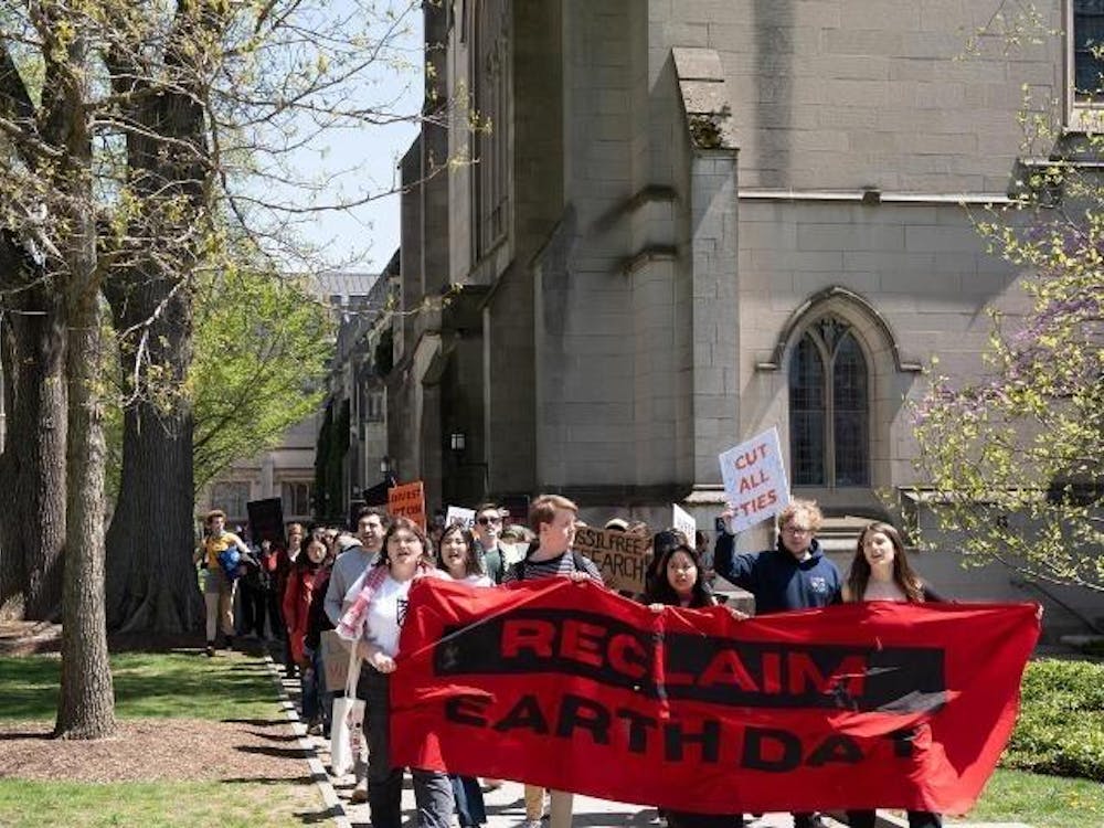
Sunrise Princeton hosts Earth Day climate walkout
Olivia Sanchez and Ethan CaldwellSunrise Princeton hosted an Earth Day climate walkout on Monday, April 22. The protest was organized with a coalition of other justice groups at the University.
Sunrise Princeton hosted an Earth Day climate walkout on Monday, April 22. The protest was organized with a coalition of other justice groups at the University.
